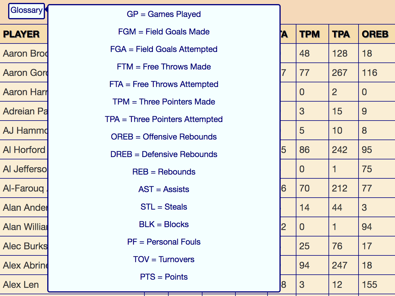
Creating the stats Glossary
1. Need for a Glossary
When looking at a stat table, the top row is usually the "header", in which each section is a label for the values in the rows below that are in the same column. Most of the time, the "header" is a shortened version of what it is representative of. To help viewers understand what the shortened version in the header means, a glossary or something of the sort is helpful to map the header label to their respective meaning.
2. Glossary HTML
<div class="Glossary"> <span class="Glossarytext">...</span> </div>
<div class="Glossary">
- "Glossary"
- <span class="Glossarytext">...</span>
- </div>
As shown, the html for the glossary is fairly
simple where
div class="Glossary" is the glossary and the
span class="Glossarytext" contains the text shown when the
cursor hovers over the glossary.
3. Glossary CSS
Since the html for the glossary is so simple, this means
that there is something going on in the background that is hard to see
from inspect. In this case is the use of CSS.
.Glossary { display:inline-block; padding-bottom:4px; background-color: azure; color: navy; border: 2px solid navy; padding-left: 2px; padding-right: 2px; margin-bottom: 8px; border-radius: 3px; }
.Glossary {
- display:inline-block;
- padding-bottom:4px;
- background-color: azure;
- color: navy;
- border: 2px solid navy;
- padding-left: 2px;
- padding-right: 2px;
- margin-bottom: 8px;
- border-raius: 3px;
}
.Glossary { margin-left: 15px; }
.Glossary {
- margin-left: 15px;
}
.Glossary >.Glossarytext { visibility: hidden; width: 400px; background-color: azure; color: navy; text-align: center; border: 2px solid navy; border-top: 2px solid navy; border-daius: 4px; padding: 5px; left: 110%; position: absolute; z-index: 1;}
.Glossary >.Glossarytext {
- visibility: hidden;
- width: 400px;
- background-color: azure;
- color: navy;
- text-align: center;
- border: 2px solid navy;
- border-top: 2px solid navy;
- border-radius: 4px;
- padding: 5px;
- left: 110%;
- /* Position the tooltip */
- position: absolute;
- z-index: 1;
CSS of the glossary when not hovered.
.Glossary:hover >.Glossarytext { visibility: visible; }
.Glossary:hover >.Glossarytext {
- visibility: visible;
}
.Glossary >.Glossarytext::after{ content: " "; position: absolute; top: 0%; right: 100%; margin-top: 0px; border-width: 7px; border-style: solid; border-color: transparent navy transparent transparent; }
.Glossary >.Glossarytext::after{
- content: " ";
- position: absolute;
- top: 0%;
- right: 100%; /* To the left of the tooltip */
- margin-top: 0px;
- border-width: 7px;
- border-style: solid;
- border-color: transparent navy transparent transparent;
}
CSS of the glossary when hovered.
4. Flexible Glossary
Now that I have the structure of the glossary, now I just need to make it show what label means what on the stat table. At the same time, since I have multiple stats with different table headers, I need the glossary to be flexible in the sense that I can easily change what is shown.


5. End Result

